Brands need to create ever-more attention-grabbing visuals that communicate their benefits and/or features consistently and effectively. One subtle yet powerful technique is to embed hidden messages within designs, to reinforce brand identity and inspire confidence. Designers have integrated these elements for many years, so, using examples from well-known brands in the UK we thought we’d share a bit more insight in this article.
What Are Hidden Messages in Design?
Hidden messages are subtle visual cues or symbols that are embedded into a design. They influence by working on a subconscious level to bolster trust. The secret to their success though lies in subtlety—overt messages risk coming across as contrived.
The Power of Shapes and Symbols
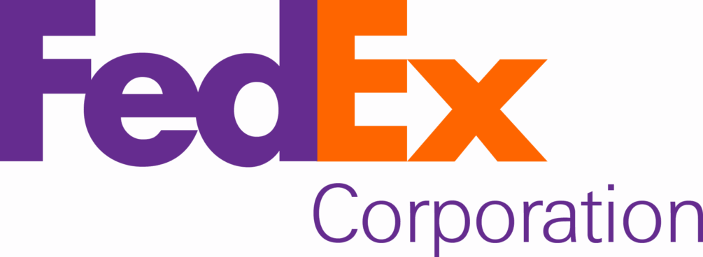
Shapes and symbols are crucial to some brands’ messaging: the FedEx logo is a famous example, with its cleverly hidden arrow between the “E” and “x”, denoting speed and precision. Another great example is that of the London Symphony Orchestra logo, where the letters join to symbolise a conductor in motion, flowing with creativity and elegance. Amazon’s arrow, stretching from the A to the Z, outlines the company’s wide range of products, with the ‘smile’ showing its commitment to customer satisfaction.
Any good designer will use these techniques with brands of any size though, often trying to think beyond the obvious – unless the obvious is exactly what that particular brand needs!
Colour Psychology
Colourschemes provoke differing emotions and the colour wheel is a designer’s ‘go to’ tool during the early stages of a brand development. Financial institutions, such as Lloyds Bank, often use green to convey growth and stability, while brands like Boots use blue to inspire trust and dependability. Designers should use colour to reinforce a brand’s values without overwhelming the viewer.
Typography with Purpose
Typography (the use of different fonts, their spacing and weights) can also be used for hidden messaging. The Co-op logo’s interlocking circles convey community and collaboration. Designers have the ability to adapt typography to reflect these values, using space or customised lettering to reinforce a brand’s ethos.
Patterns and Backgrounds
Backgrounds and patterns often go unnoticed, but can subtly shape our perception. John Lewis, for instance, uses clean, understated designs to emphasise quality and reliability. Subtle textures or organic patterns in branding materials can promote a mood or complement a brand’s narrative.
Understanding Context and Audience
Knowing the target audience is essential when planning hidden elements. Cultural preferences, age groups and lifestyles all influence how messages are received. A minimalist approach might appeal to younger audiences, but traditional motifs could resonate more with older generations.
Top Tips for those Looking to Work with Designers
- Stay True to your Brand: Ensure any hidden elements reflect your brand’s core values and message. Never put them there just for the sake of it.
- Be Subtle: Avoid making elements too obvious; nobody wants something that’s trying too hard – it looks contrived.
- Test Your Design: Ask around for feedback to make sure your audience will see things the way you intended.
- Act Ethically: Never use misleading imagery or other people’s intellectual property (including photos) without permission.
In summary, done well, incorporating hidden messages can be a great way of enhancing a brand’s identity and trust. These embedded meaningful cues create visuals that resonate, inspire confidence and build loyalty with every glance.
Let’s create something brilliant together.


Leave a Reply